Results 1 to 5 of 5

Thread: Improved?

  1. #1
    Fabio_R's Fruitcup Reputation: 180
    kuturu4FA's Avatar
    Join Date
    Aug 2008
    Posts
    3,632
    Rep Power
    20

    Default Improved?

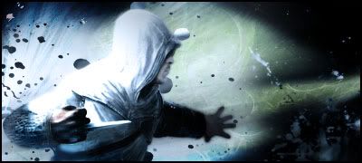
    Hey Just wanted to know if i improved this is my 2nd Sig, so please don't be too cruel lol, anyway i went a diff direction, i'd like to know your thoughts and how i can fix this, I for one think its too bright but don't know how to solve that thank you!

    Old Sig:


    New Sig:


    Hey This is a new one i was bored today and didn't know what to do so wondering if this is any good?


    Plz help lol <--ima nub


    Heres the Sig with my IGN better or worse?


  2. #2
    Cloud13's Clown Reputation: 57
    Duo's Avatar
    Join Date
    Aug 2006
    Location
    twitch.tv/after5
    Posts
    2,846
    Rep Power
    20

    Default

    The new sig is definitely better than your old one.

    Some reasons why:

    1. In your old sig, having a flat, digital abstract contrast against a realistic human is like having Mario from Super Mario Galaxy running around in Super Mario 64.

    2. Wise choice on making a border for your second signature. Leaving the bottom corner with white blankness would be a flaw in my opinion.

    3. The man in your new signature looks a lot more suited to his environment.

    4. Your new sig is smaller. Personal preference, really.

    5. Your new sig is smooth and congruent. Your old signature is too sharp cornered and rough looking in comparison.


    I personally don't think it's too bright. Perhaps it's because we have different monitor settings, but regardless, the easiest way to reduce the brightness would be to open it in photoshop and lower the brightness via the Image? tab I believe.

    It looks good otherwise. Good job.

  3. #3
    Fabio_R's Fruitcup Reputation: 180
    kuturu4FA's Avatar
    Join Date
    Aug 2008
    Posts
    3,632
    Rep Power
    20

    Default

    Thanks for the info, really appreciate it, but i have a question i want to put my IGN, what font would look best and where at, i was thinking bottom right corner, but that would draw away attention right? or if i made it small enough to wear people didn't really notice it at first

  4. #4
    Cloud13's Clown Reputation: 57
    Duo's Avatar
    Join Date
    Aug 2006
    Location
    twitch.tv/after5
    Posts
    2,846
    Rep Power
    20

    Default

    In my opinion, if you're making a signature with your name or IGN on it, the name is kind of supposed to stick out. I know that my current signature is kind of contradictory to that statement with me having merged the text with the thief's hat, but the fact that I put my name on the thief, the object that stands out the most due to the glowing dagger and sticking out of the square, should give it more attention.

    As for the font, I would use something thin or something sharp so that it can stand out. Just as how your first signature has your name with a smooth font contrasted against a sharp background, contrast your name with a sharp font against a smooth background. Too much of one texture is a bad thing.

  5. #5
    Cloud's Hair Spray Reputation: 13
    Clayotix's Avatar
    Join Date
    Feb 2009
    Location
    Laying In Bed With Carmen Electra
    Posts
    63
    Rep Power
    16

    Default [o.o]

    mmmm same here i dont see a perfect spot for a name,BUT u could possibly put it in the right bottom corner but u must blend it ,or erase a little with low opacity.

Posting Permissions

  • You may not post new threads
  • You may not post replies
  • You may not post attachments
  • You may not edit your posts
  •